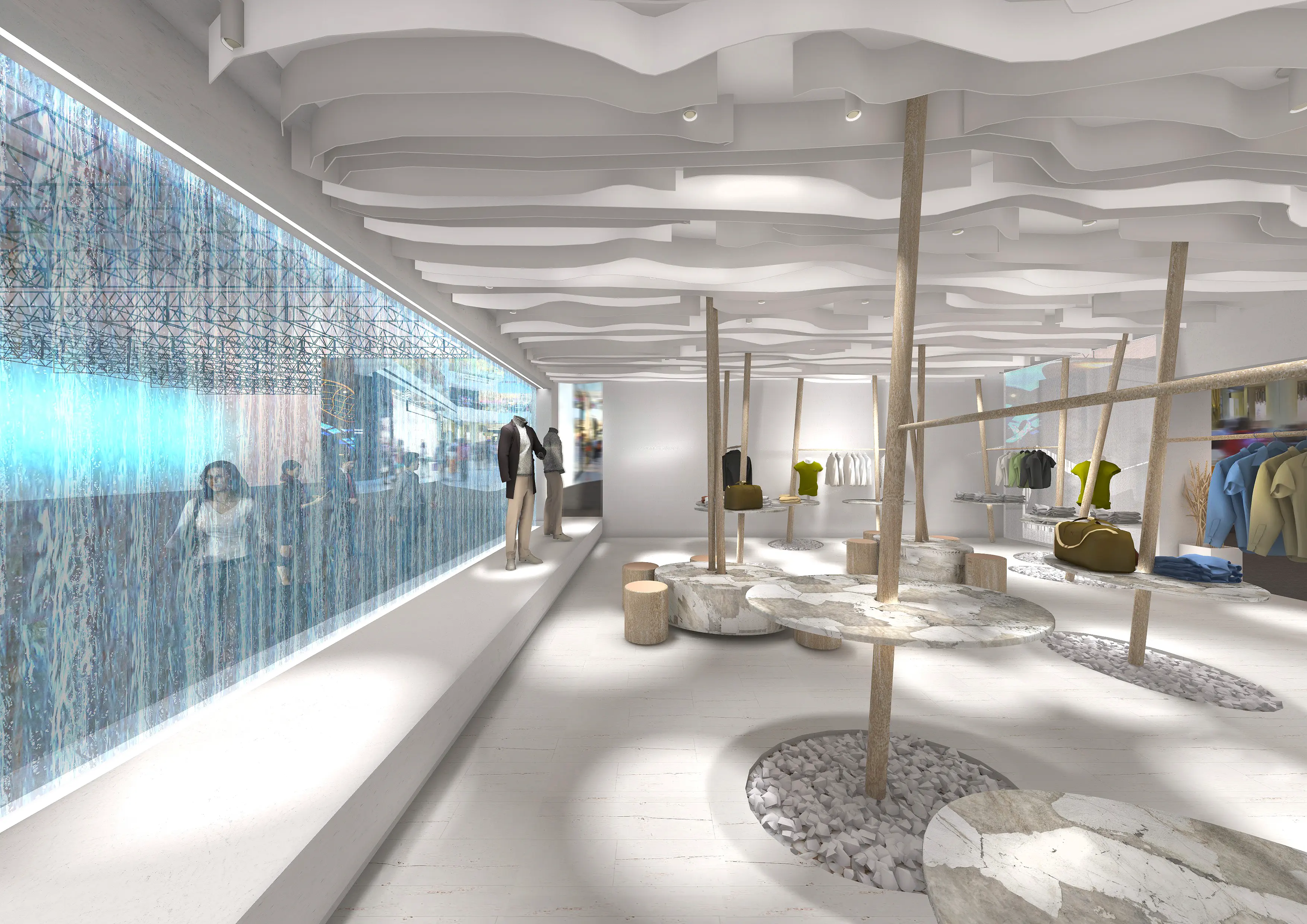
Colour and light shape how a visitor feels inside your stand before they read a single word or speak to anyone. They are the fastest communication tools in exhibition design — and the most consistently underestimated.
The psychology of colour in stand design
Colour is not just an aesthetic decision; it is a communicative one:
- Warm colours (red, orange, yellow): energy, urgency, approachability. Ideal for FMCG, food, lifestyle.
- Cool colours (blue, green, grey): trust, stability, technology. Ideal for finance, industry, healthcare, tech.
- Black and white: premium, minimalism, elegance. Applies in fashion, cosmetics, luxury.
- Key point: the stand colour must be consistent with brand identity, not just with current trends.
The three types of light in a trade show stand
- Ambient light: establishes the overall brightness level of the space. Determines whether the stand feels open or enclosed, welcoming or cold.
- Accent light: directs attention towards specific products, graphics or areas. This is the light that sells.
- Decorative light: creates atmosphere and reinforces the brand's visual identity. Generates the differentiating sensory experience.
A well-lit stand combines all three types in balance. A poorly lit one usually relies on ambient light alone.
Colour temperature: the detail that makes the biggest difference
- 2700-3000K (warm white): food, fashion, cosmetics, lifestyle, wood.
- 3500-4000K (neutral white): versatile, healthcare, offices, education.
- 4000-5000K (cool white): technology, industry, pharmaceutical, automotive.
A colour temperature error can make a food product look unappetising or a piece of jewellery lose its brilliance. It is one of the most common mistakes and one of the easiest to avoid.
Smart LED: programmability and energy efficiency
- Programmable LED systems allow colour and temperature to change throughout the day.
- Reduce energy consumption by 40-60% compared to traditional solutions.
- More and more fair venues (Fira de Barcelona, IFEMA) require low-consumption systems.
The 5 most common lighting mistakes in stands
- Uniform light without contrast: a visually flat stand with no hierarchy.
- Dark corporate colour without a counterpoint of light to activate it.
- Graphics without backlighting or a dedicated spot light.
- Wrong colour temperature for the sector or product.
- Accumulation of too many light sources that tires the visitor's eye.
Want to see how we have resolved colour and light in real projects?
Explore our stand portfolio and discover the detail that makes the difference.
View projects Contact us